6 Best Practices For Designing Eye Catching Lenticular Cards

Designing for lenticular cards isn’t as simple as prepping a standard print file. A flat image that looks crisp on screen can turn muddy or ghosted once it’s interlaced, and text that reads cleanly on paper often doubles or blurs when the lens shifts the viewing angle. These issues catch a lot of designers off guard, since the format hides its quirks until the final print stage.
In turn, this has made businesses and designers reconsider their whole process of handling artworks right from the beginning, taking into account factors like depth, angle, and movement rather than just thinking of it as a static, one-dimensional layout. This translates to early stage layout tests, image selection where movement adds value, and more thoughtful typography, spacing, and contrast choices.
The good news is that these problems are entirely avoidable with the right approach.
Below are six practices to apply before sending artwork to production, whether you’re creating a single collectible or a full run of branded trading cards.
1. Choose Bold, High-Contrast Color Palettes
As the lenticular lens divides the design into interlaced stripes, the use of gradients and low-contrast palettes will blur in the end result and become undefined. On the other hand, high-contrast colors and clear separation between objects and the background in the image will preserve their sharpness and clarity after lenticular treatment.
Providers experienced in custom lenticular printing can usually flag color choices that are likely to wash out before a design goes into full production, which saves a costly reprint down the line.
2. Match the Design to the Right Motion Effect
Not every image works equally well across flip, 3D, and motion lenticular styles, so it helps to choose the effect based on what the artwork is actually trying to communicate. A simple two-image flip works well for before-and-after comparisons, or logo reveals, while a 3D illusion suits artwork with clear foreground and background layers that benefit from a sense of depth.
Motion or zoom effects, built from a longer sequence of frames, are better suited to conveying movement, transformation, or a build-up toward a final image. Designing with the intended effect in mind from the start, rather than retrofitting existing artwork to whichever format seems most popular, produces a noticeably cleaner result.
3. Keep Text and Fine Detail to a Minimum
Small text and intricate linework are two of the fastest ways to undermine an otherwise strong lenticular design. The finer the detail in the image, the more it may blur, double, or be completely lost depending on the viewing angle.
If there must be text, such as a brand name, slogan, or card number, the shorter it is, the thicker the strokes of it, and the farther away it is from complex background details, the better chances it has of remaining legible.
4. Design With Lens Frequency and Card Size in Mind
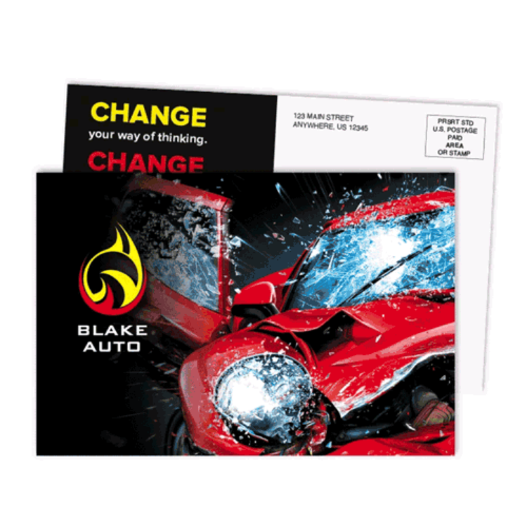
Lenticular lenses come in different line frequencies, typically measured in lines per inch, and the right choice depends heavily on how close a viewer will be to the finished card. A small, handheld piece, like a wallet-sized trading card or business card, generally uses a finer, higher-lpi lens designed for close viewing, while larger formats, like posters, use a coarser lens meant to be seen from farther away.
Designing artwork without accounting for final card size and lens frequency is one of the most common reasons a lenticular effect looks impressive on a proof but underwhelming once it’s actually printed and cut to size.
5. Create Clear Foreground, Midground, and Background Layers
A convincing 3D lenticular effect depends on more than just a striking image — it depends on how clearly the artwork separates into distinct depth layers before it’s ever sent to production. Elements meant to appear closest to the observer should be made into a separate foreground layer, while there must be details in the midground and a simpler background after them. If this step is skipped, the lens will have nothing to work with, and the effect will be two-dimensional.
Overlapping elements slightly across layers, rather than placing them side by side, is one of the easiest ways to emphasize depth after lenticular printing.
6. Test the Design Before Committing to a Full Run
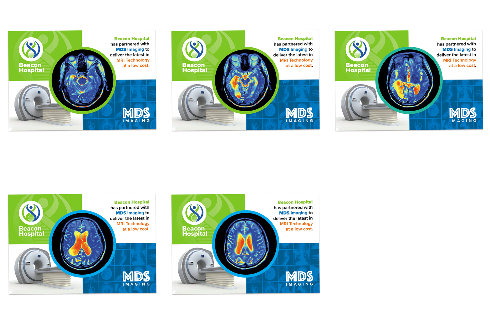
A design that looks strong as a flat digital mockup doesn’t always translate the way you expect once it is converted into a lenticular print. Viewing a physical proof allows you to check how the images transition, whether the text remains legible, and whether the depth or motion effects look clear from different angles.
Requesting a sample or proof before a full production run also allows you to catch problems such as ghosting, banding, image misalignment, or awkward transitions while they are still inexpensive to fix. Testing the card from different viewing angles and distances can help ensure the final design delivers the intended effect.
Final Thoughts
Creating a lenticular print goes beyond just making something look good on the screen; it also requires considering how it will look after printing, including color, movement, typography, and viewing distance.
Bold contrast, simplified detail, an effect matched to the message, and a proof before full production all go a long way toward making sure the final card lives up to the format’s novelty. The success of lenticular print lies in its specialized design over anything else, and that’s why a card is worth keeping.